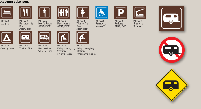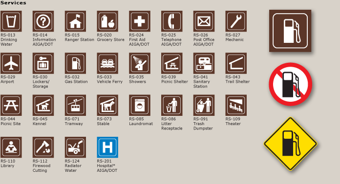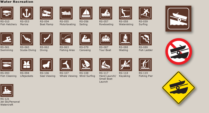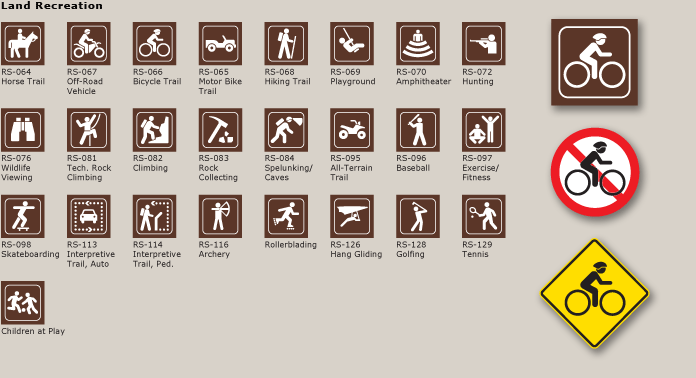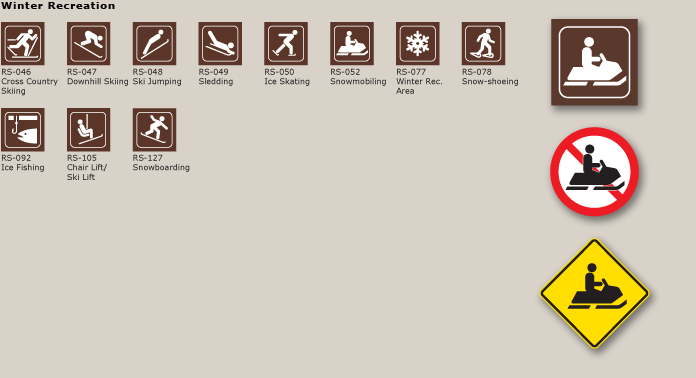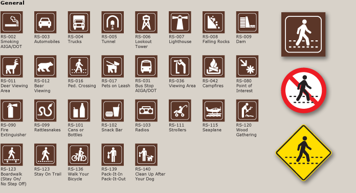
Beginning in the mid 1983 Donald Meeker (*) coordinated a team to design the original 71 symbols for the Corps of Engineers recreation area signage. The symbols were placed in the public domain while managed by our firm for the Society for Environmental Graphic Design (SEGD). With subsequent support from the National Park Service, National Endowment for the Arts, and Alberta Parks, the system has evolved into a 138-symbol system. Many of these symbols have been proposed for inclusion into the US federal highway sign manual (MUTCD) in January 2008. These symbols are now used by federal, state, and local park agencies and similar organizations worldwide. (* Originally with Danne & Blackburn, and Meeker continued project after D&B firm disbanded in 1985)
When we started designing the new recreation sign standards for the Corps of Engineers, we recommended that the design of the symbols be based on the 1977 AIGA/USDOT Symbol Signs for Transportation Related Facilities. This new recreation symbol project would incorporate twelve of the most universal symbols (men, woman, no smoking, etc., as noted) from the AIGA/DOT system with modifications for stroke and gap to optimize their use on signage and viewing from a distance. Our goal was to create a common visual language for symbols used in public places. The twelve symbols adopted from the AIGA/USDOT set are identified (AIGA/DOT).
This system was designed to replace the National Park recreation symbols that originally consisted of twelve basic symbols in 1964, but grew over the next twenty years into a visually eclectic 80 plus symbol program without common voice or visual control. The SEGD program has been managed by our firm as a volunteer project for the Corps of Engineers and SEGD since its inception as a way to keep the system visually cohesive.
Keeping the system fresh remains a work in progress at Meeker & Associates. Symbols have been updated and added over the years. Symbols are not equal. Many are used on road guide signs, but some are appropriate only for smaller applications. Equally important, some symbols represent lesser-known aspects of recreation, and some symbols are site specific. In those instances, symbols are frequently displayed with qualifying text.
Every symbol has a story involving the design process. Two examples include a child in a baby stroller and children at play. I designed the stroller symbol in 1990 when my middle son was three years old. I took a Polaroid profile photograph of him for reference. That symbol was recently proposed to be part of the federal highway manual. Jeff Smith and I designed the symbol of children playing soccer for a Canadian park project for use as a roadway warning sign to reflect the dynamic intensity of kids at play.
Our designs of the recreation symbols have been prepared over the past twenty-five years by a team of five designers: Donald Meeker, Chris O'Hara, Paul Singer, Peter Reedijk, and Jeff Smith. We based our work on visual standards recommended by Dr. Irwin M. Siegel, research ophthalmologist at the New York University Medical Center. We have incorporated a similar approach used by the USDOT/AIGA Symbol Sign team to make each symbol clearly represent the essence of the object or action, that it is a cohesive system, and that the symbols are legible and understandable.

