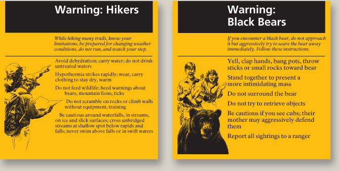
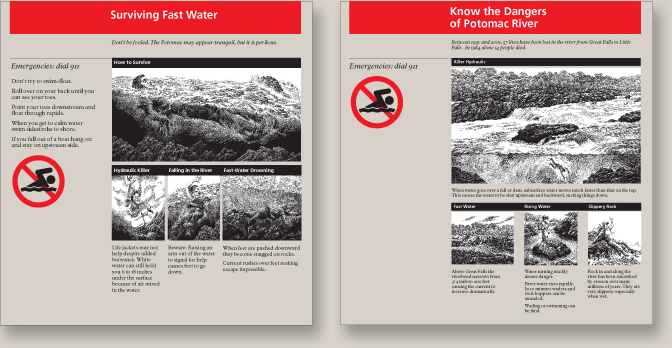
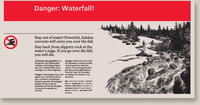
Conditions in national parks are unusual for the average person, especially the first-time visitor. Most injuries stem from exposure to too much sun or cold, but the parks contain many other hazards. Our design team, including writer Bruce Hopkins and illustrator Larry Duke, worked on ways to warn visitors about hazardous conditions from the High Sierras to the Potomac River and down to the bottom of Grand Canyon. We talked with rangers, reviewed accident data, and studied actual conditions in the field to create clear and easy- to-understand warnings.
Our solutions addressed “the streaker, the stroller, and the student” to accommodate visitors who just glance at or spend three minutes to read a panel. We also included illustrations to attract visitors who are visually inclined and those who do not know English. The format includes: a clear drawing of the hazard, bold headline identifying the hazard using referential colors, succinct instructions on avoidance and a clear description of the consequences, and, in some cases, providing information in foreign languages. A glance at a panel would clearly identify the hazard. The editorial approach is firm but respectfully educational, allowing parents to use the panel to teach their children about hazards.
Our solutions addressed “the streaker, the stroller, and the student” to accommodate visitors who just glance at or spend three minutes to read a panel. We also included illustrations to attract visitors who are visually inclined and those who do not know English. The format includes: a clear drawing of the hazard, bold headline identifying the hazard using referential colors, succinct instructions on avoidance and a clear description of the consequences, and, in some cases, providing information in foreign languages. A glance at a panel would clearly identify the hazard. The editorial approach is firm but respectfully educational, allowing parents to use the panel to teach their children about hazards.


