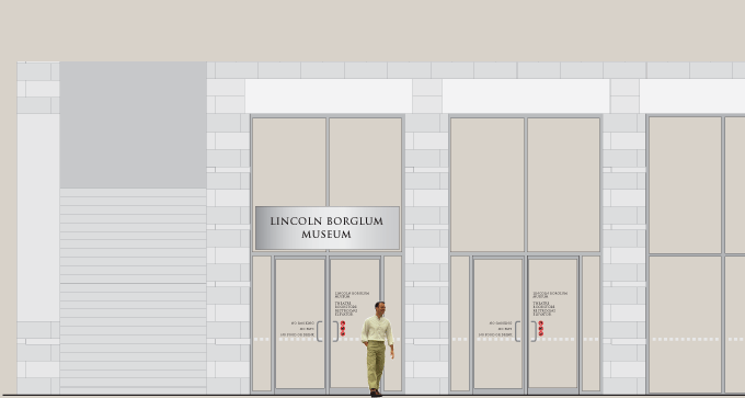
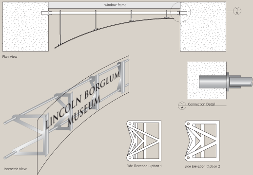
In the early 1990s, the memorial began a massive building program that included a large viewing plaza, museum, concession buildings, visitor center, and two multi-deck parking facilities. The buildings were built without accommodation for signage. Meeker & Associates developed solutions that integrated signage into the architecture and reflected the character of the site. We designed identification panels made of rolled and etched stainless that were precisely engineered to accommodate existing angles of view with minimal penetration into building structures.
Our signage components at Mount Rushmore included tactile mapping for disabled persons, hourly-events schedules at key decision points, trail mapping, parking deck signing with electronic controls to accommodate traffic distribution, lamp structures on the main viewing plaza, and pedestrian guidance to the museum and amphitheater.
In this example, the restroom pavilion was faced with an expansive glass front and had minimal identification. As part of the solution, we prepared portraits for large, etched-mirror stainless panels with the presidents on the right and their wives and Jefferson's daughter on the left. This was conceived as a metaphor to the actual monument that takes its form from a long distance view. When viewed up close, the images are abstract, but when viewed 30 feet away on the public plaza the images are very clear. The design brings the eye in to a formal modern granite-faced building while creating interest from the plaza.


