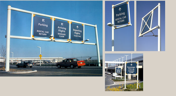
The primary function of our new roadway sign program for the Greater Rochester International Airport was to make access and egress easy to understand for the first-time traveler and to make this mid-size regional facility appear similar to larger metropolitan hub airports. Our design plan integrated a distinctive fabricated tubular frame and square sign panel format that reflected architectural details on the terminal building’s exterior. We selected structure colors that would look bright in a geographic region that is overcast much of the time.


